Beyond Beige: The Definitive Guide to 2026 Interior Color Combinations
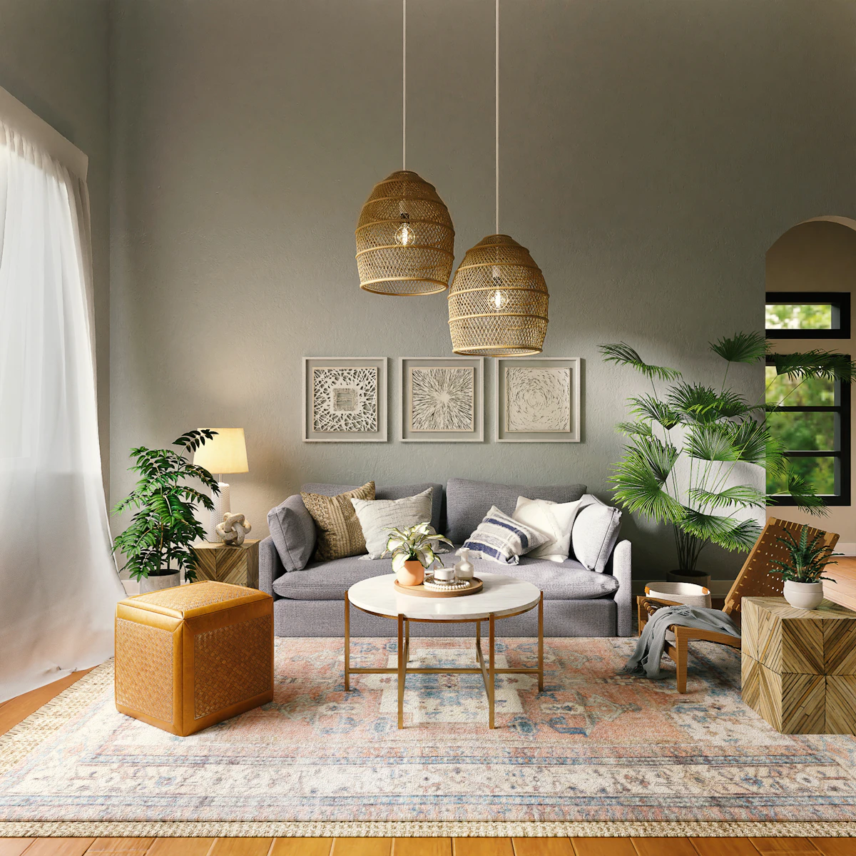
In our last post, we discussed the major shift toward Sensory Luxury — the move away from sterile, flat surfaces in favour of warm, tactile materials like travertine, mixed woods, and fluted panels. But materials are only half the story.
The way we combine colour in 2026 is shifting dramatically. We are trading the stark, cool-toned grays and bright whites of the past for a palette that feels grounded, moody, and deeply rooted in nature. Whether you are finalising laminates for a custom TV unit or rendering a complete two-bedroom flat presentation, these are the top colour combinations defining interior design this year.
1. Baked Terracotta & Warm Plaster White
The all-white room is evolving. Instead of clinical, cool whites, designers are specifying warm, creamy plaster tones and pairing them with the earthy depth of baked terracotta. This combination is inherently tactile and works exceptionally well in living areas where you want to promote relaxation and warmth. The terracotta acts as an anchor — often used on feature walls, large area rugs, or heavily textured upholstery — while the warm white provides breathing room so the space doesn't feel heavy.
2. Olive Canopy & Rich Walnut
Biophilic design isn't going anywhere, but it is maturing. Instead of bright, tropical greens, the 2026 palette favours deep, muted olive and sage. When paired with rich, dark woods like walnut or mahogany, this combination creates an instant sense of sanctuary and sophistication — a brilliant strategy for bedrooms or intimate lounges. Design tip for compact spaces: if you are designing a standard 2 BHK layout, try an olive green textured wallpaper behind the bed, paired with walnut side tables and brushed chrome wall sconces.
3. Deep Aubergine & Brushed Chrome
This is where 2026 gets moody and dramatic. As we see a rise in highly expressive, purple-veined marbles like Calacatta Viola, the surrounding palettes are following suit. Aubergine, deep plum, and burgundy are being used as statement colours, particularly in dining spaces, powder rooms, or custom cabinetry. To keep these jewel tones from feeling traditional or heavy, they are contrasted with the sleek, cool edge of brushed chrome and matte silver hardware.
4. Ochre & Charcoal Dust
Yellow is notoriously difficult to get right in high-end interiors, but muted, earthy ochre and mustard tones are breaking through this year. To ground the warmth of the ochre and prevent it from looking overly retro, pair it with soft, dusty charcoal instead of harsh black. This combination is highly effective in modern kitchens or as the primary palette for a custom TV unit — think charcoal fluted panelling accented with ochre shelving and integrated LED lighting that highlights warm timber grains.
The project management takeaway: as you integrate these richer, deeper colours into your BOQ, remember that dark and deeply pigmented paints often require an extra coat or a specific tinted primer to achieve full opacity. Be sure to account for this slight bump in material and labour costs when finalising your client estimates.
Ready to transform your space?
Book a free consultation with our design team today.